A0 Festival
︎︎︎Brand identity
︎︎︎3D design
︎︎︎Web design
2023
Bachelor’s final project in Design
With the ambition to create a memorable experience within a momentary construction, A0 was born. A project that aims to encourage curiosity and interest in culture, both art, music, theater and dance, in the Canary Islands through a fictional cultural festival.
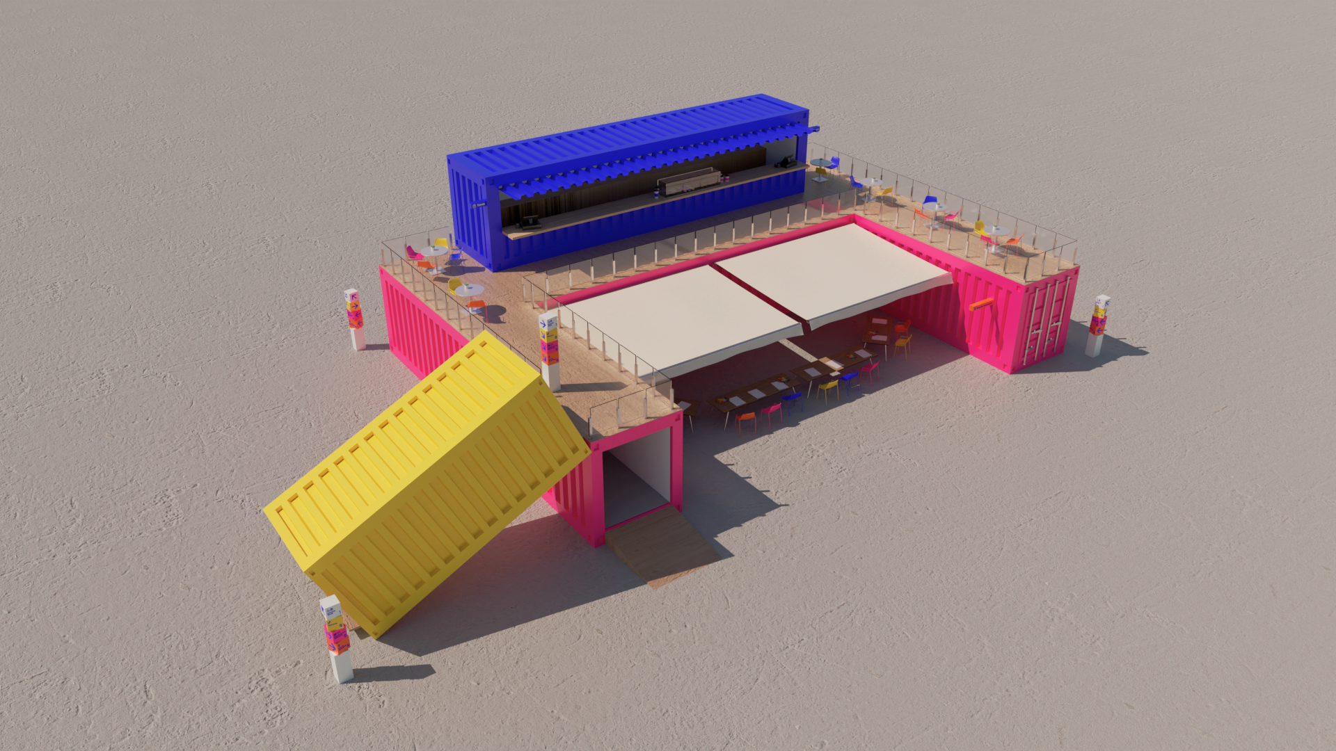
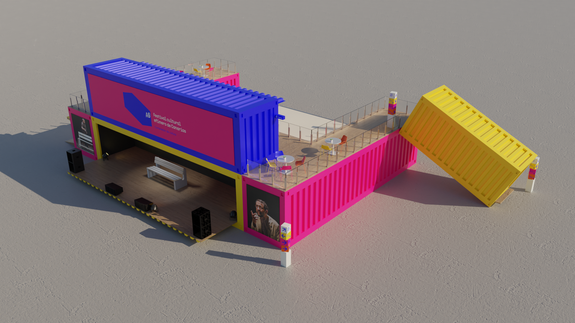
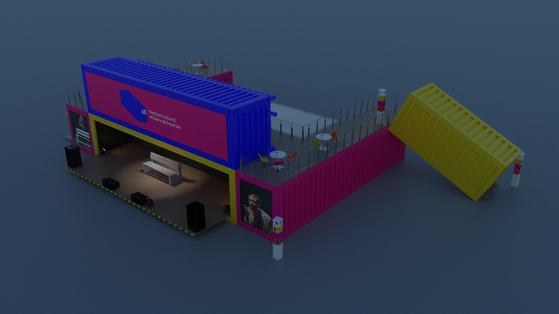
Merging the fields of design and architecture, a space will be devised by means of maritime containers that will house this cultural festival for three months.
The oxymoron between the ephemeral and the enduring that is proposed aims to resolve the question that what is capable of disappearing is also capable of remaining, in this case, not physically but mentally. To do this, the space where the festival will take place have to be designed as well as a strong visual identity, an attractive programme to all types of audiences and diverse promotional materials. With these ideals, A0 arises.
︎︎︎Visual identity
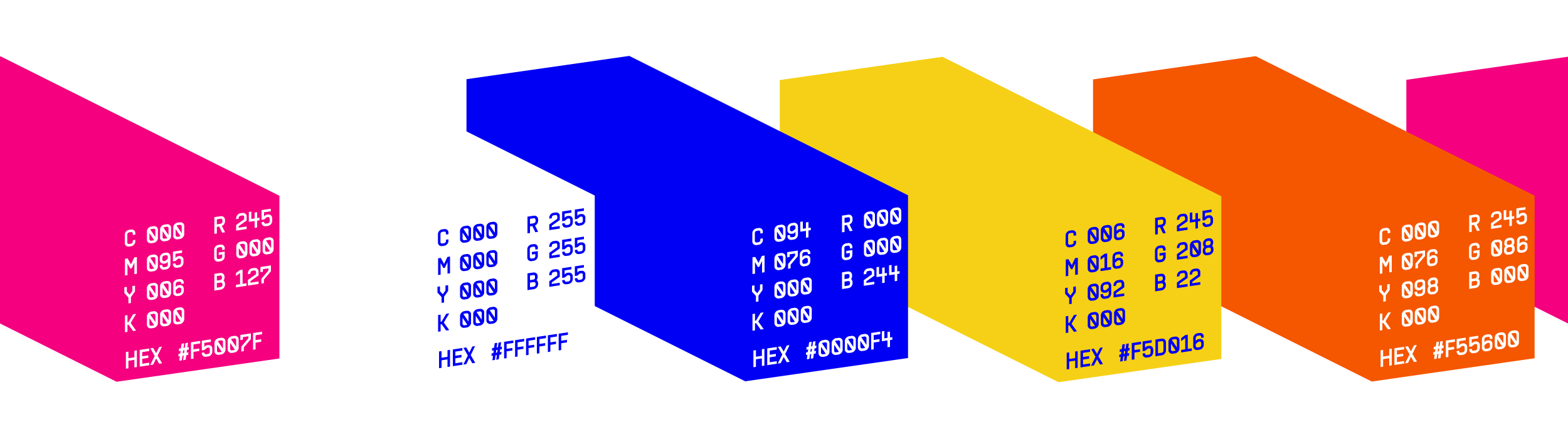
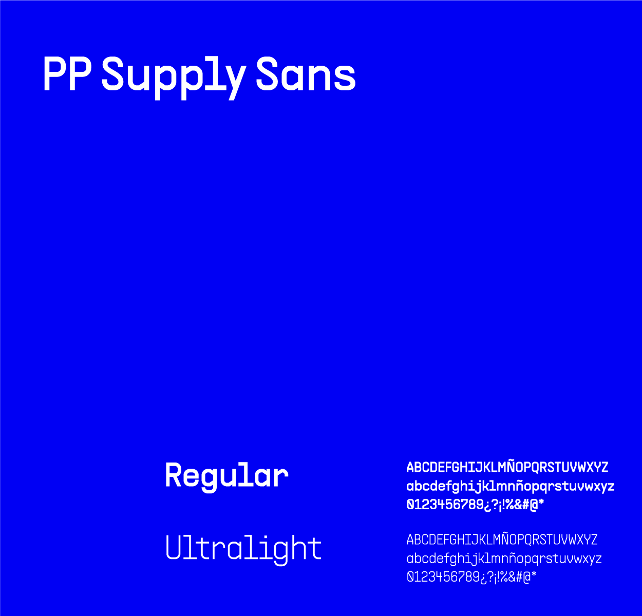
A0’s visual identity consist on an isologo with tagline which briefly explain the festival’s purpose. The color palette that was chosen is vibrant and colorful with some of the colors making up the Canary flag. In addition to that, each color represents an artistic manifestation that it is celebrated within the festival. With regard to the typography, there are two diverse ones. Atkinson Hyperlegible was chosen thanks to its legibility and PP Supply Sans for its resemblance with the typography used for the identification of maritime containers.

︎︎︎3D Design
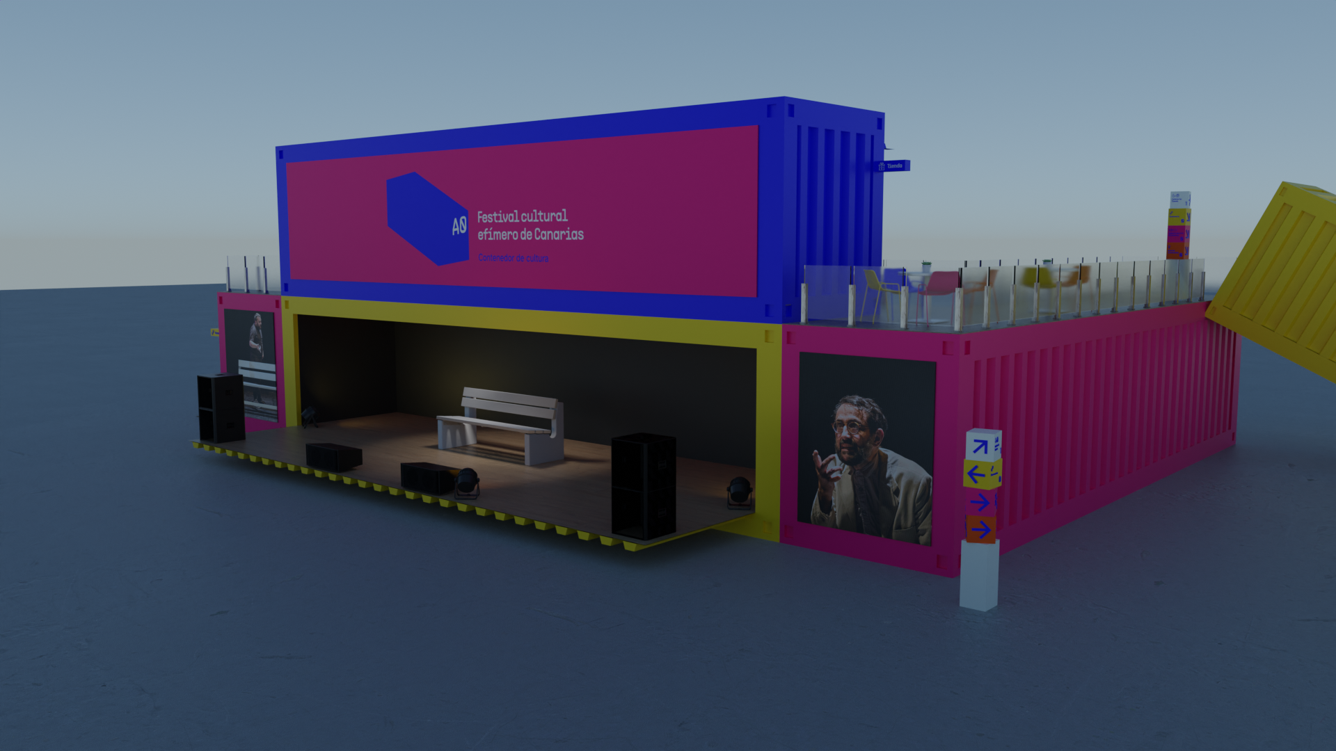
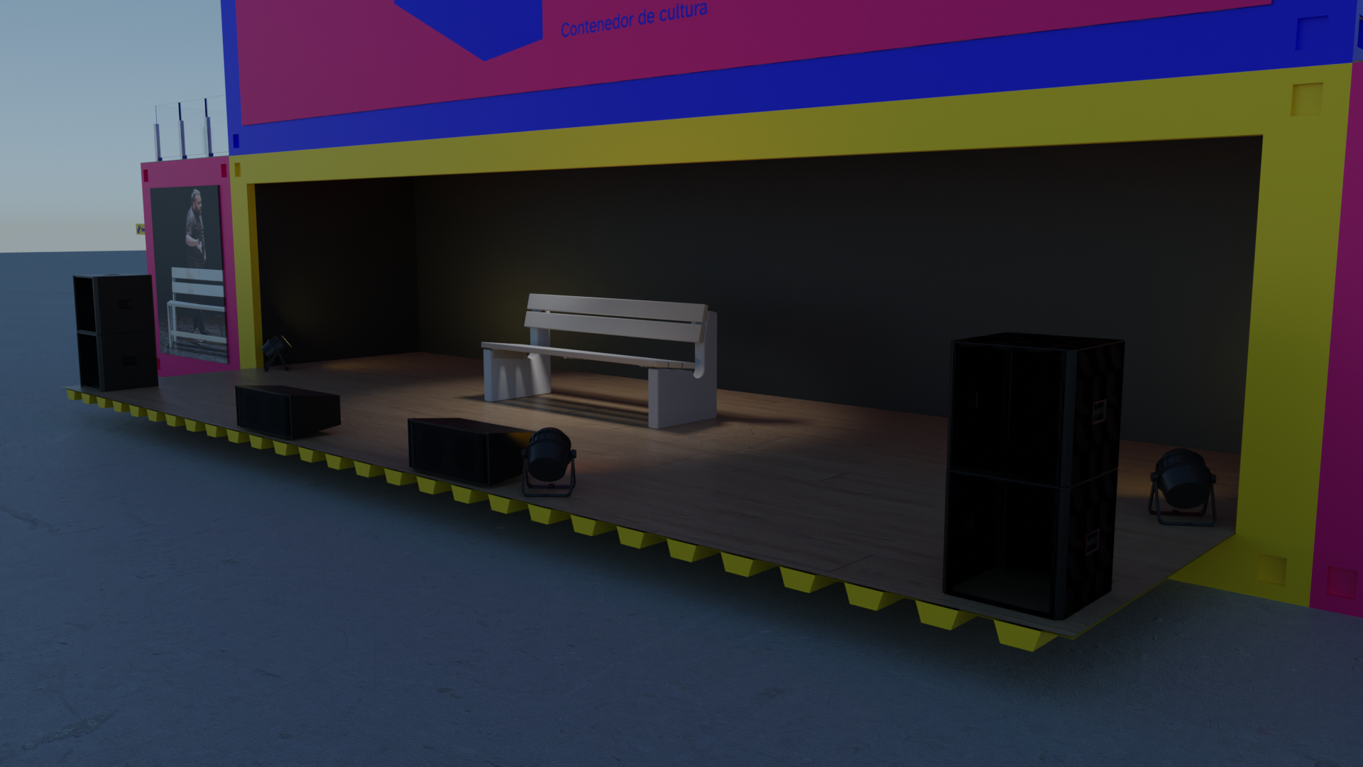
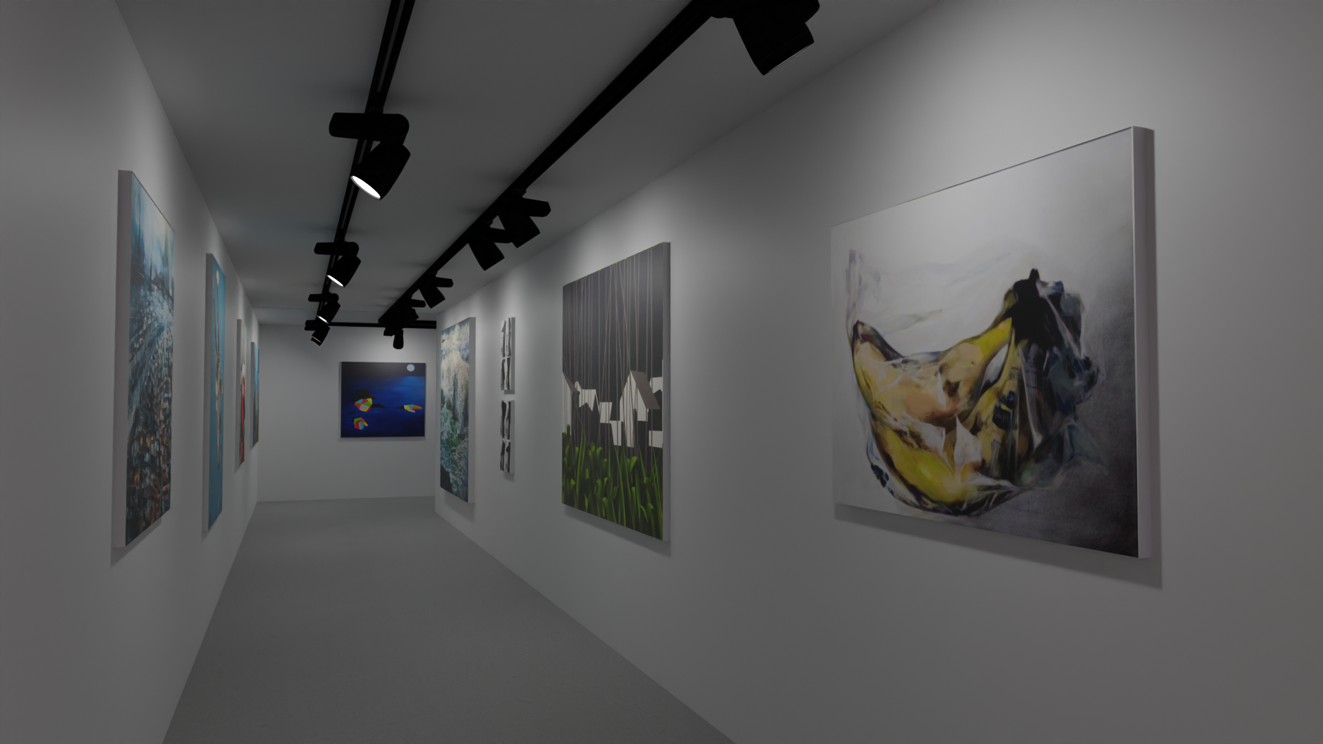
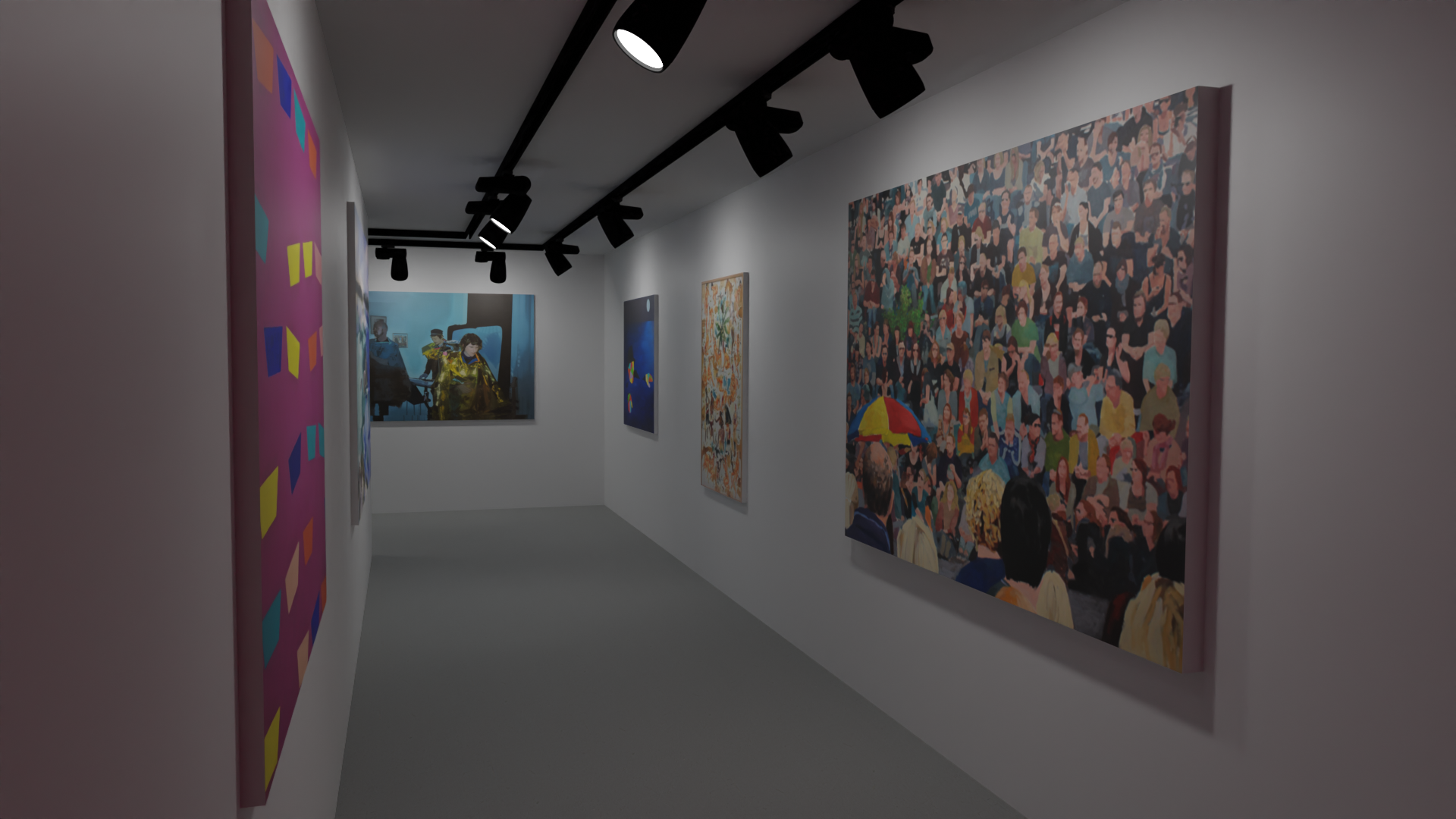
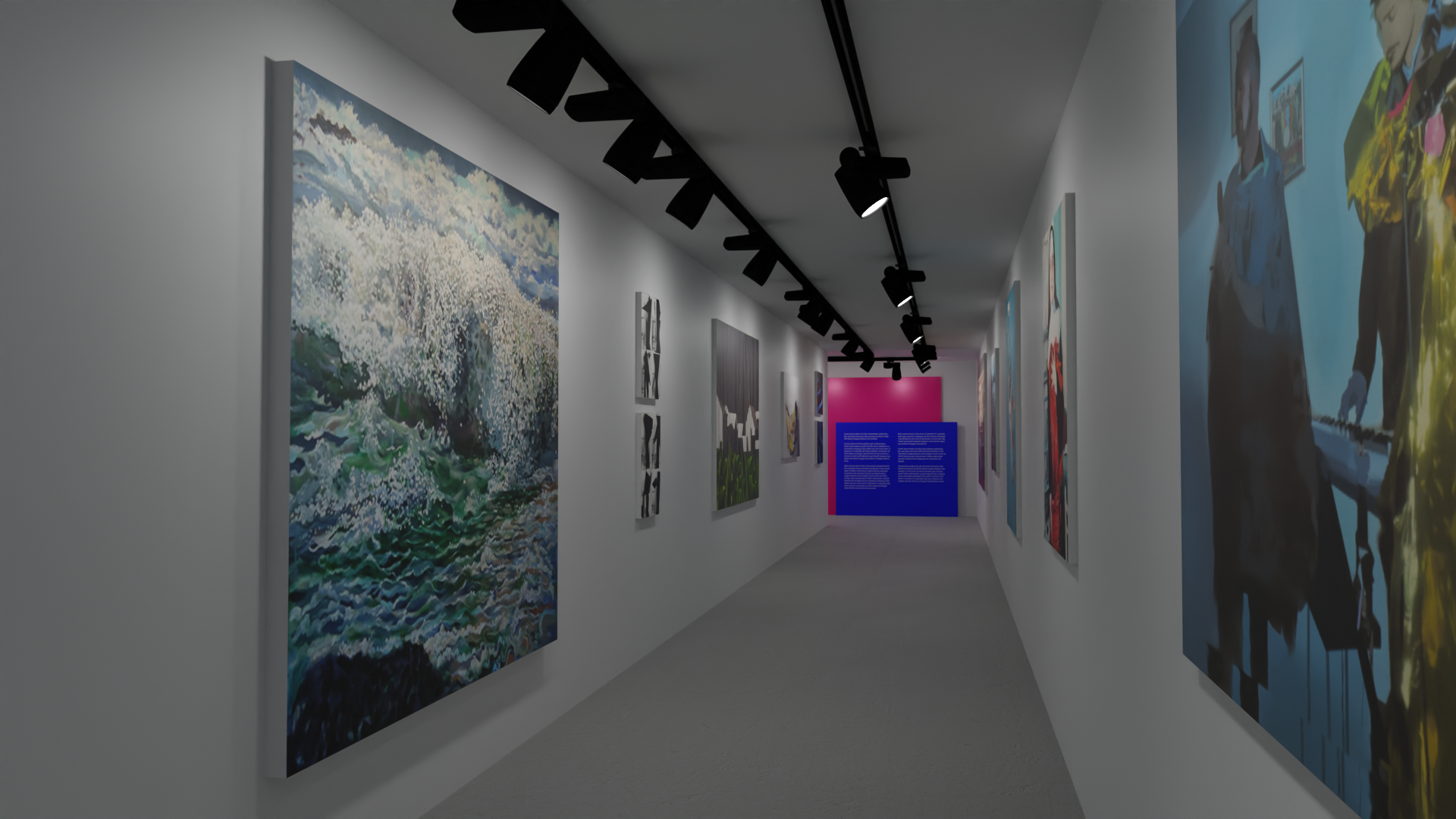
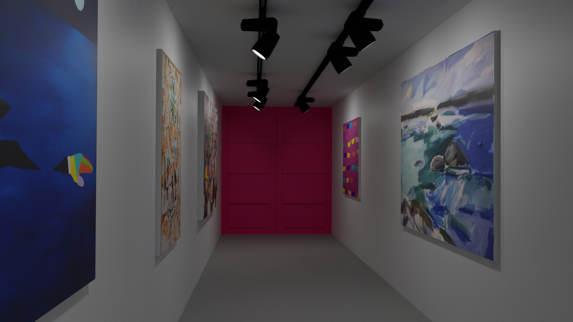
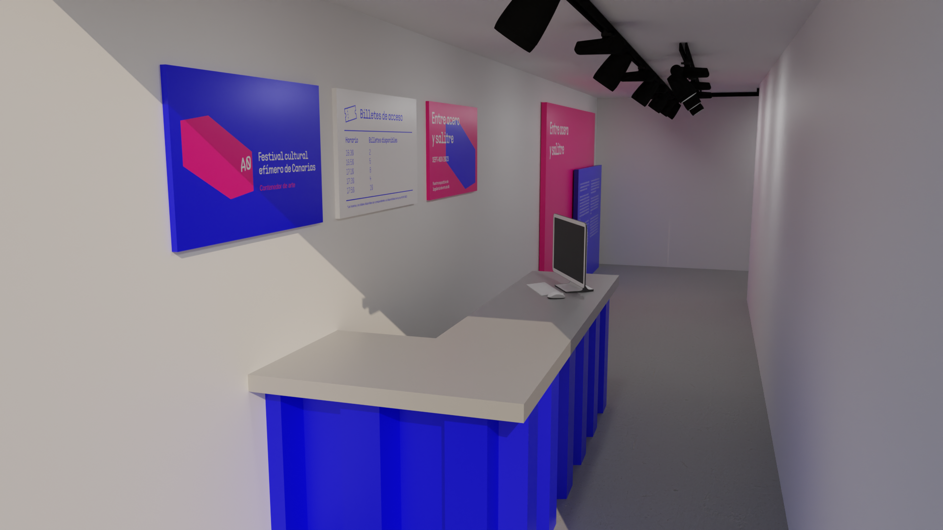
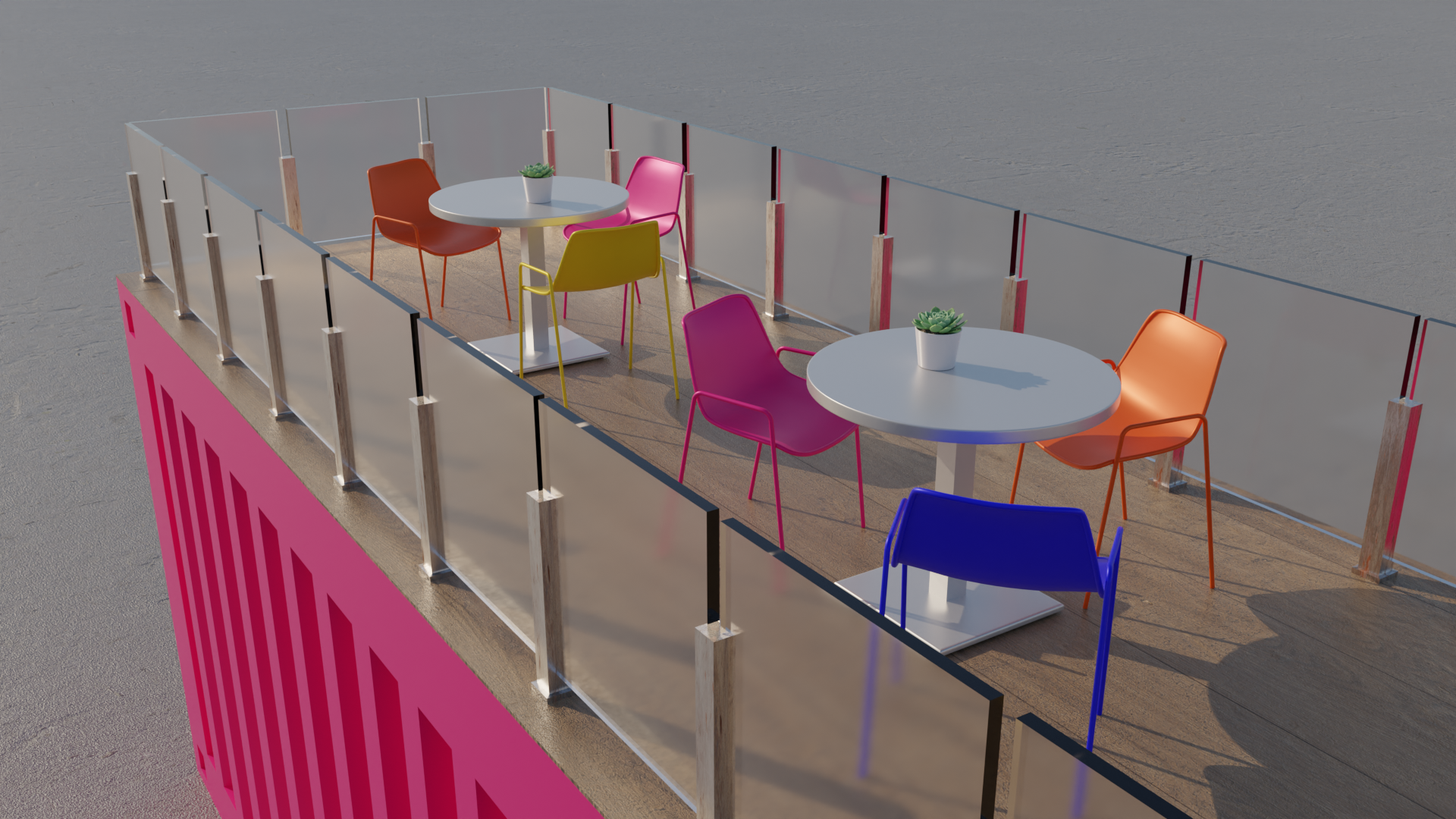
Thanks to the diverse characteristics of shipping containers such as their modular property, their speed of assembly and their resistance, they allow the creation of spaces that can be enabled for different functions. In A0, there are four well-differentiated spaces: a stage, an art gallery, an interdisciplinary area and a leisure area with a cafeteria and a gift shop.
a


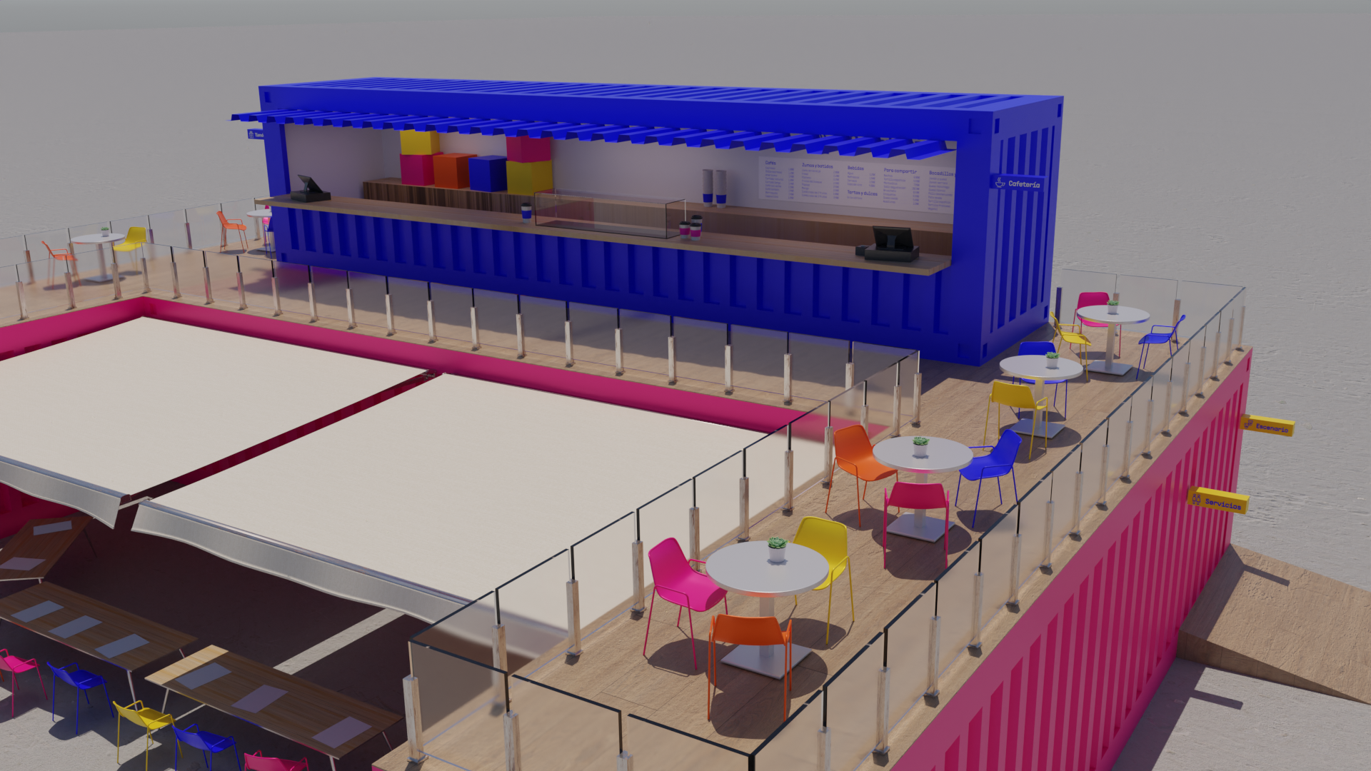

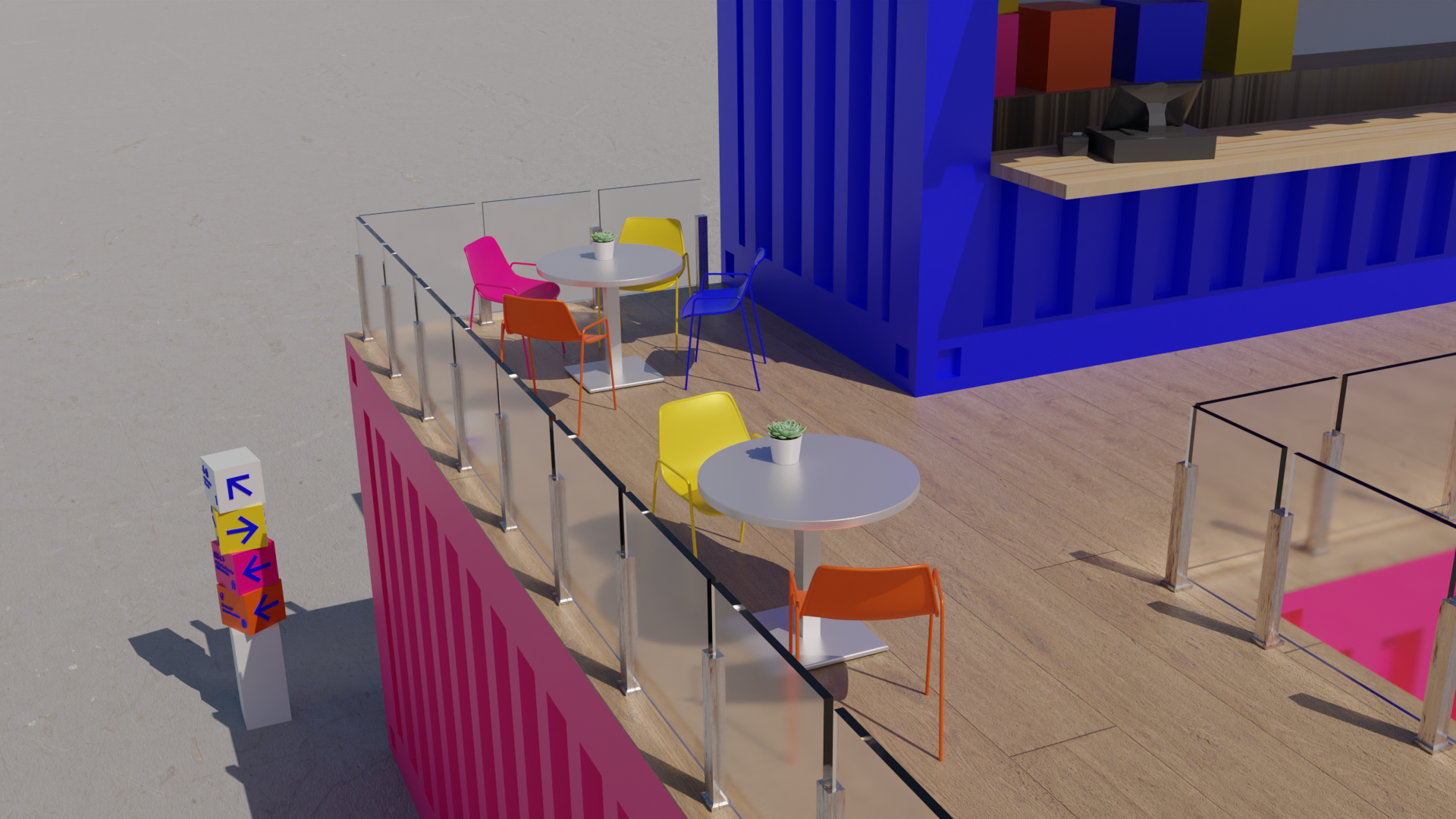

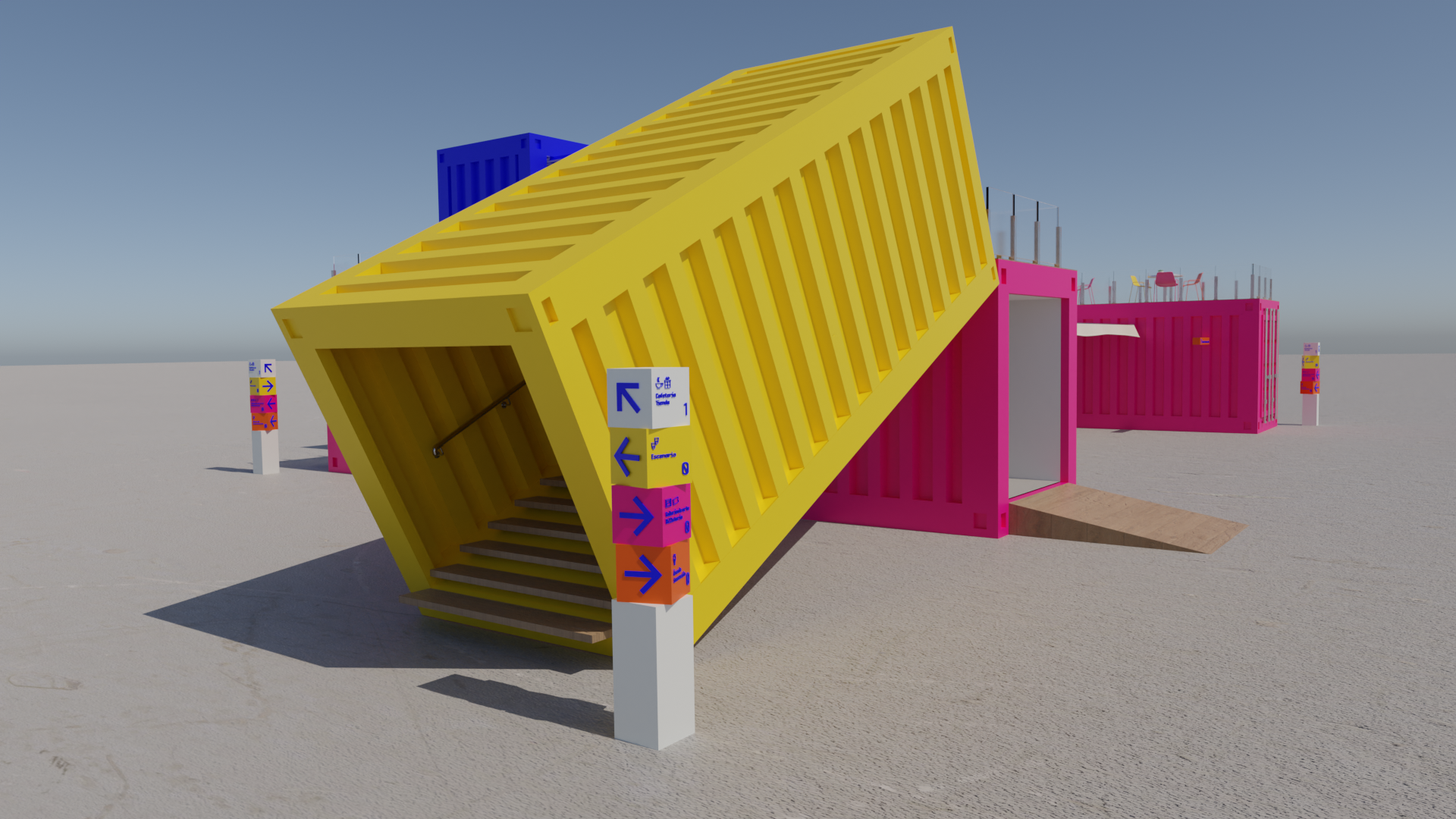
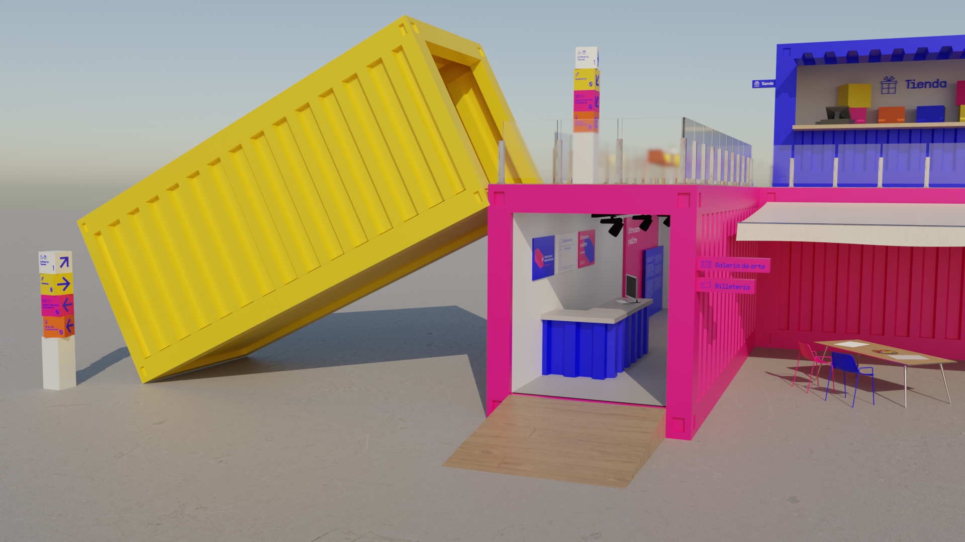
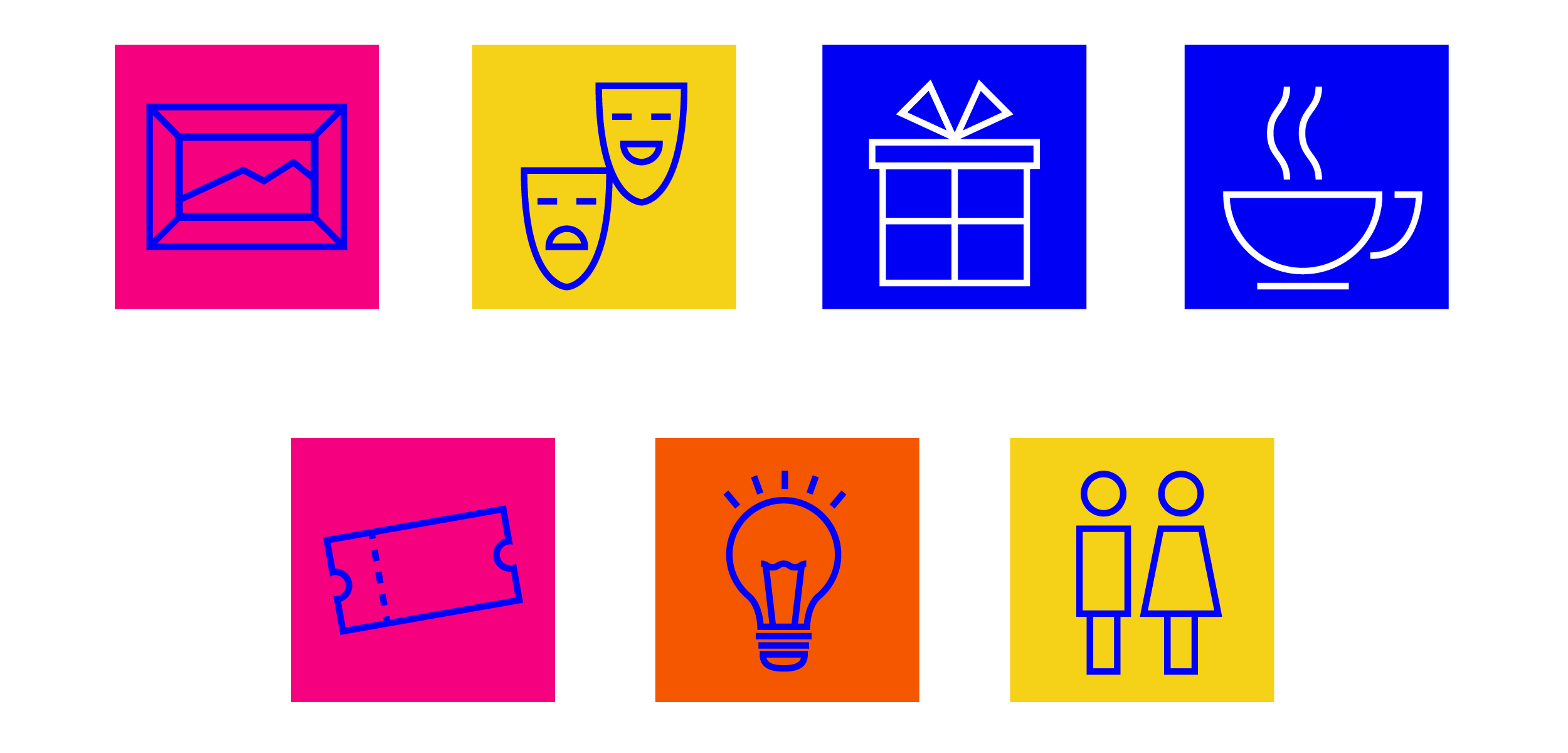
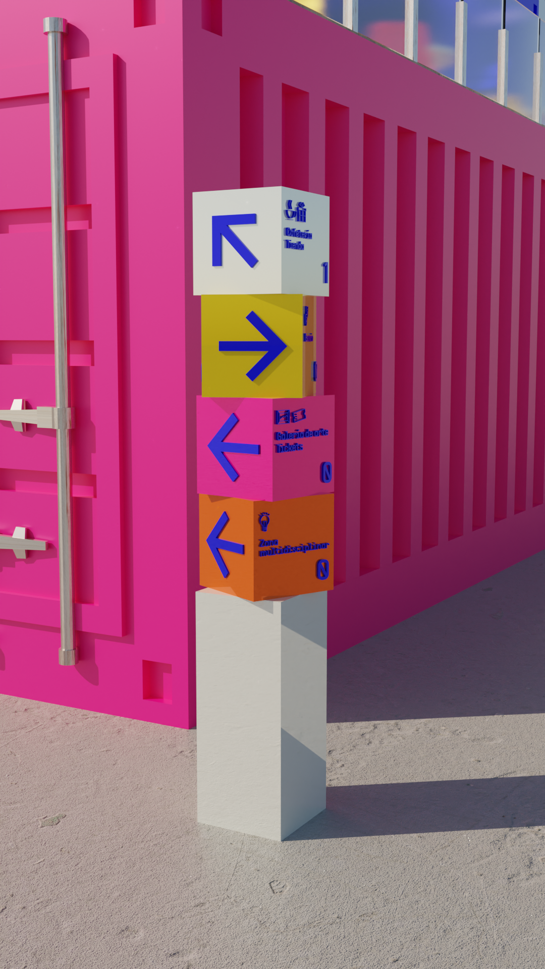
︎︎︎Signage system
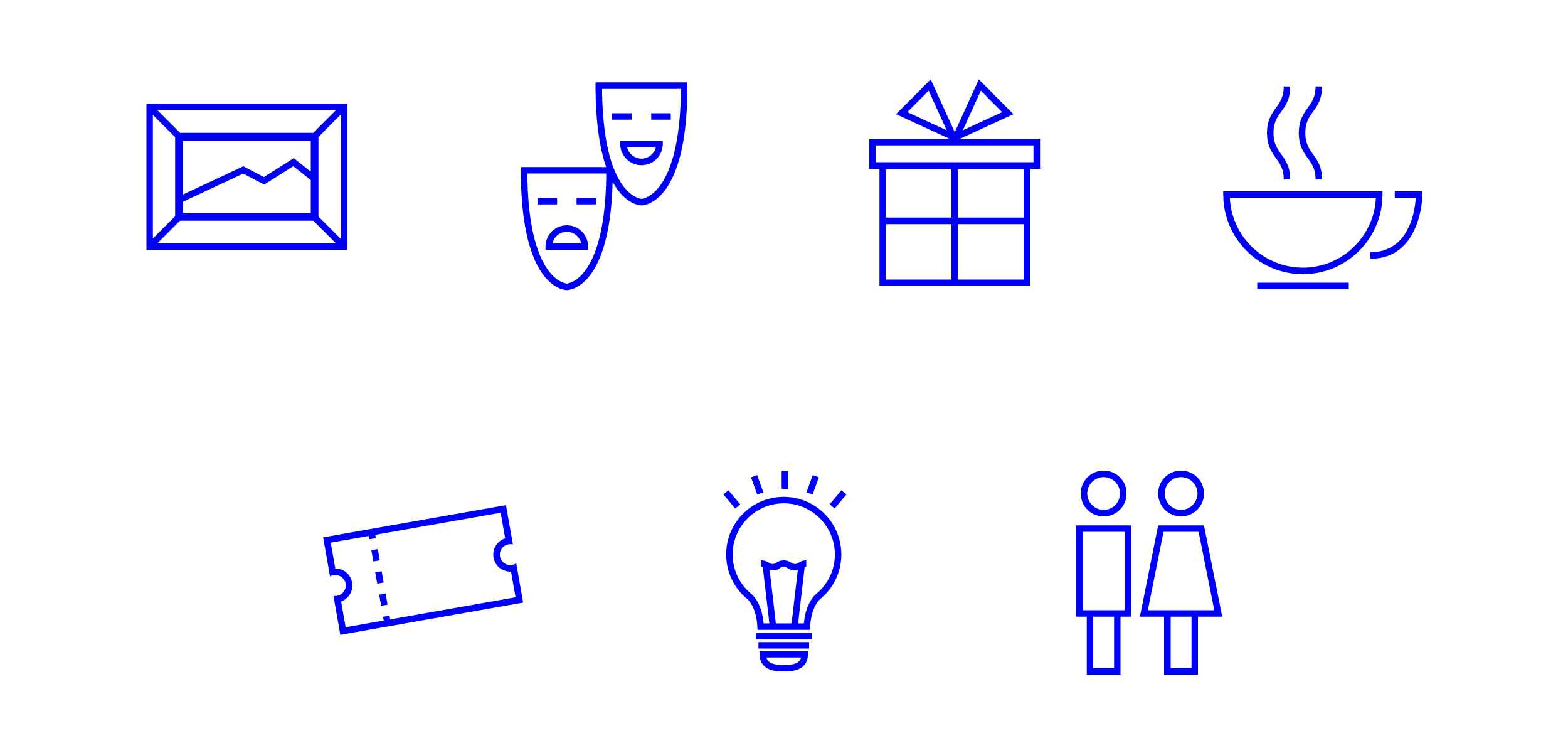
An adequate signage system was designed. This system consist on a series of icons and two types of signage which allows visitors to move with independence creating a better, safer and more organized environment. Moreover, this reinforce the A0’s visual identity by using the colors and the corporate typography of the festival.


︎︎︎Web design
The festival’s website was created with Cargo Site to promote and communicate the most relevant information about A0.
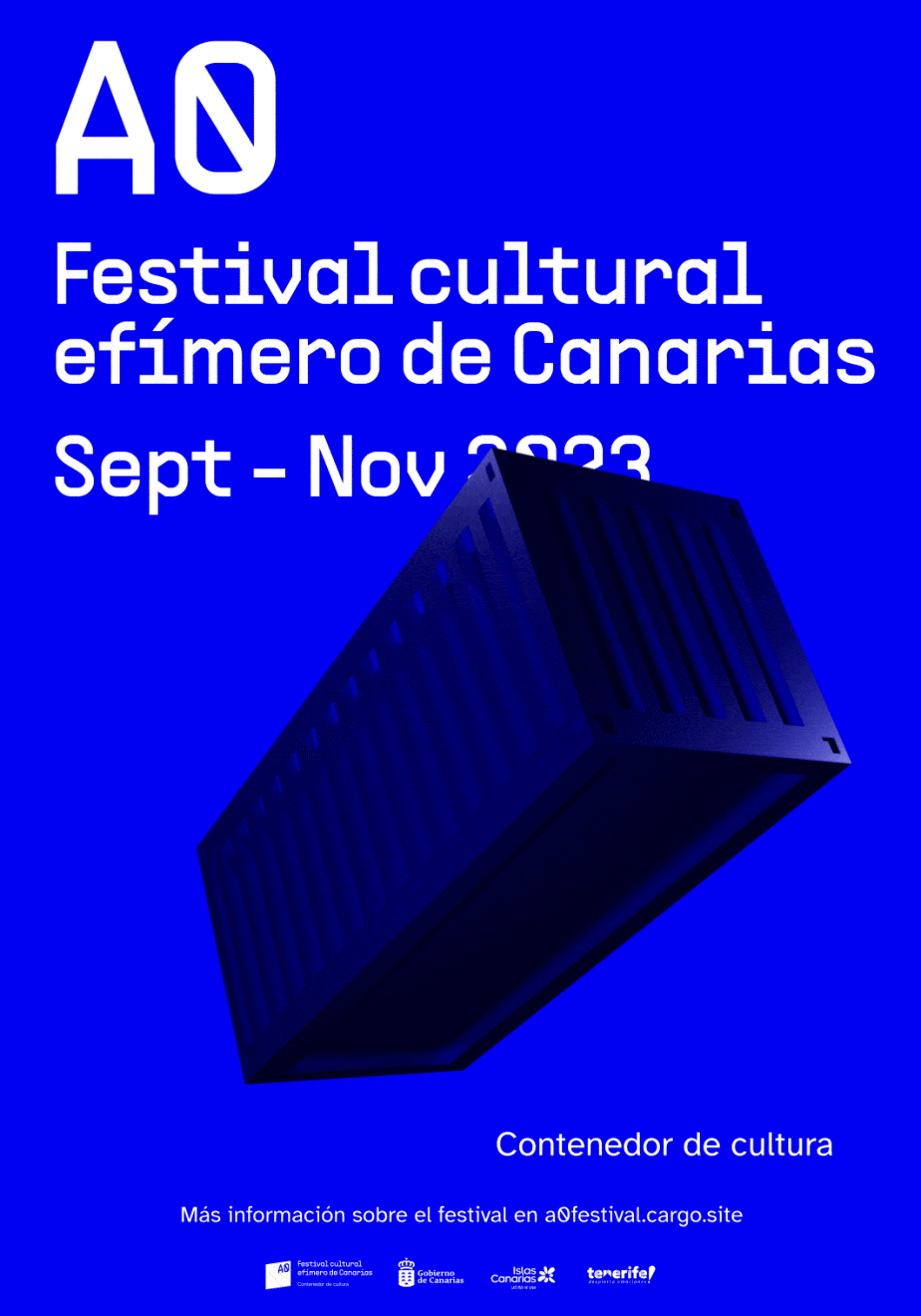
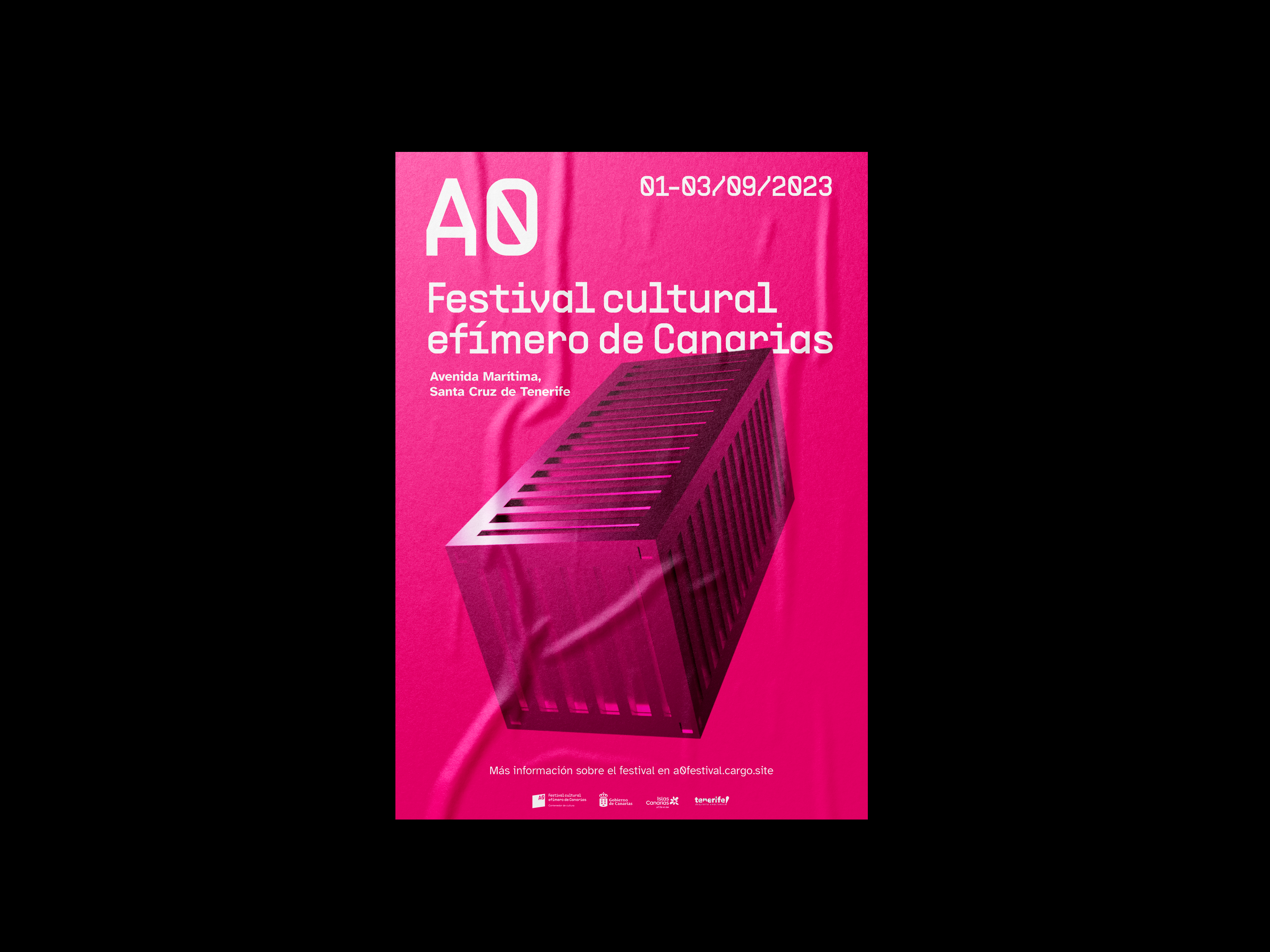
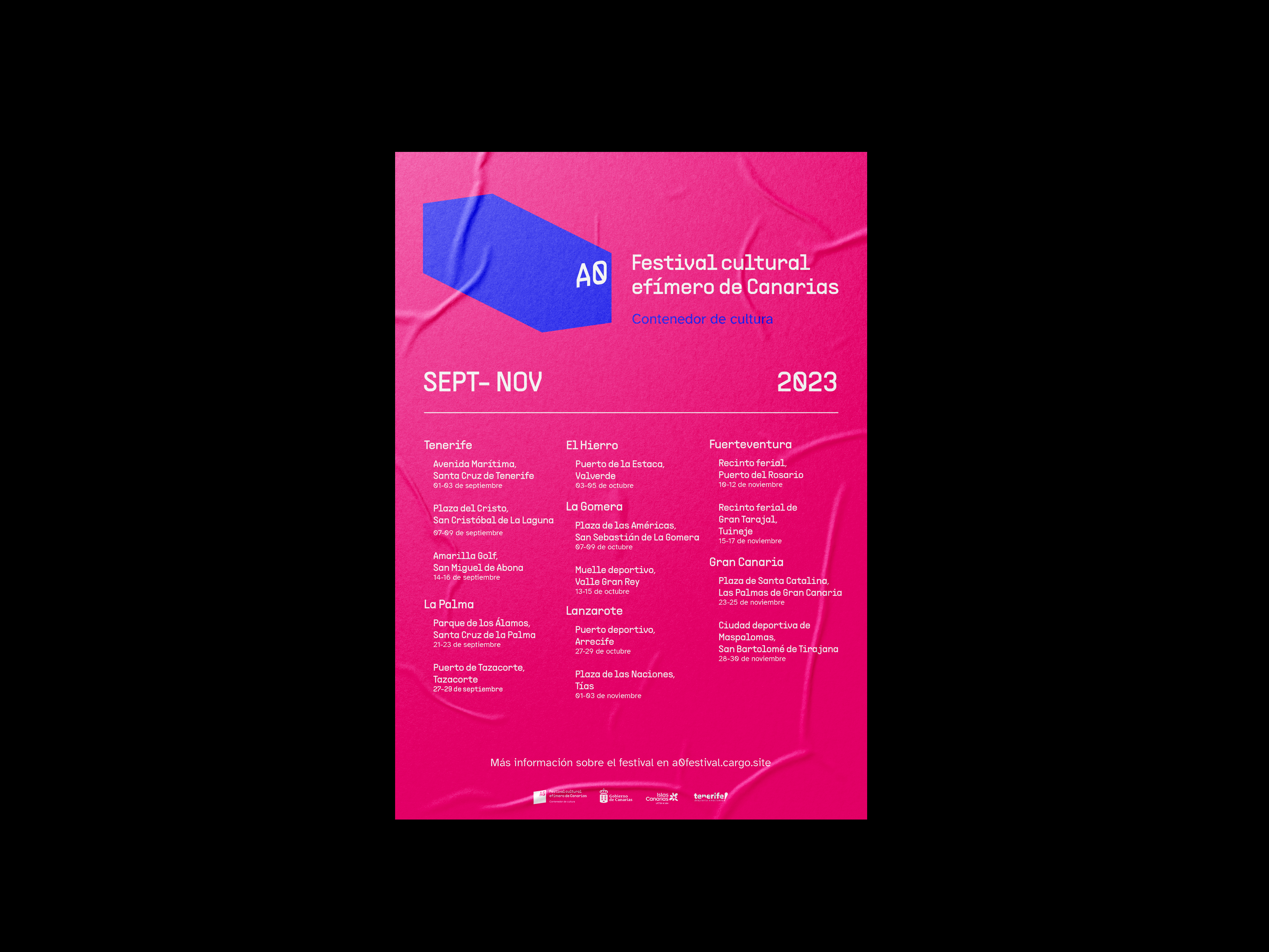
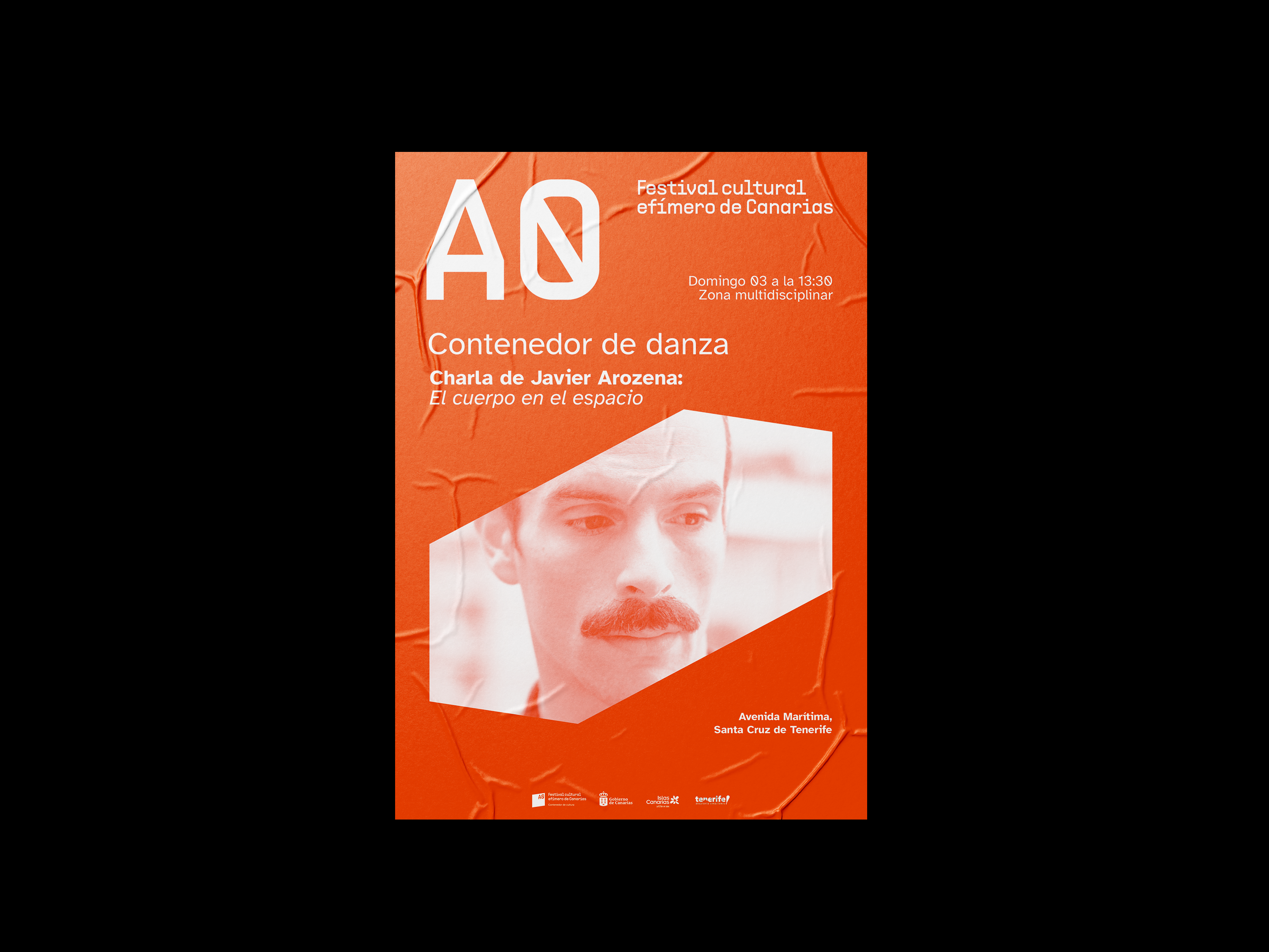
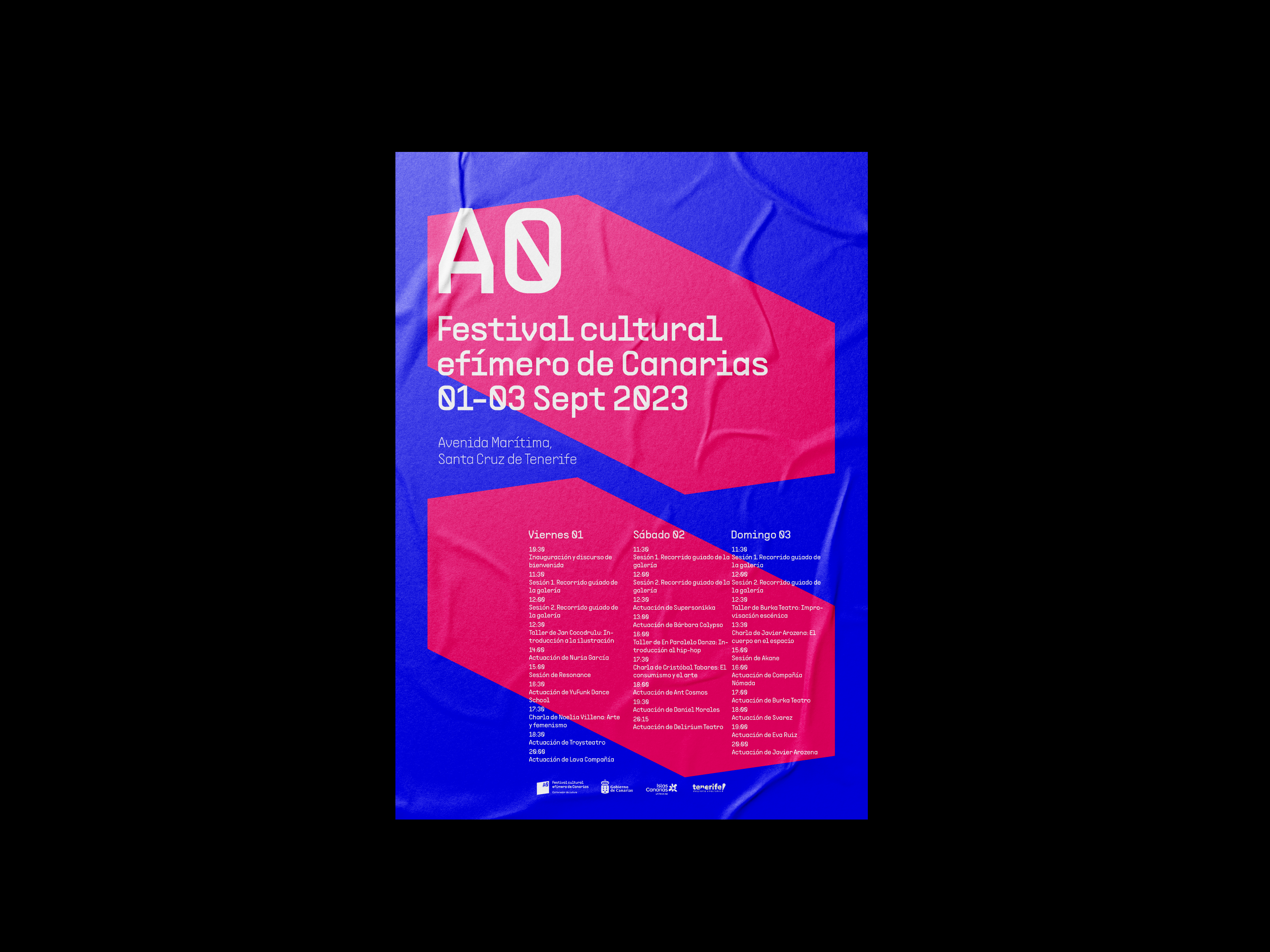
︎︎︎Posters
Posters play a key role in the communication and promotion of the A0 festival, representing its identity and awakening interest in the festival. Aspects such as legibility and visual impact were taken into account.

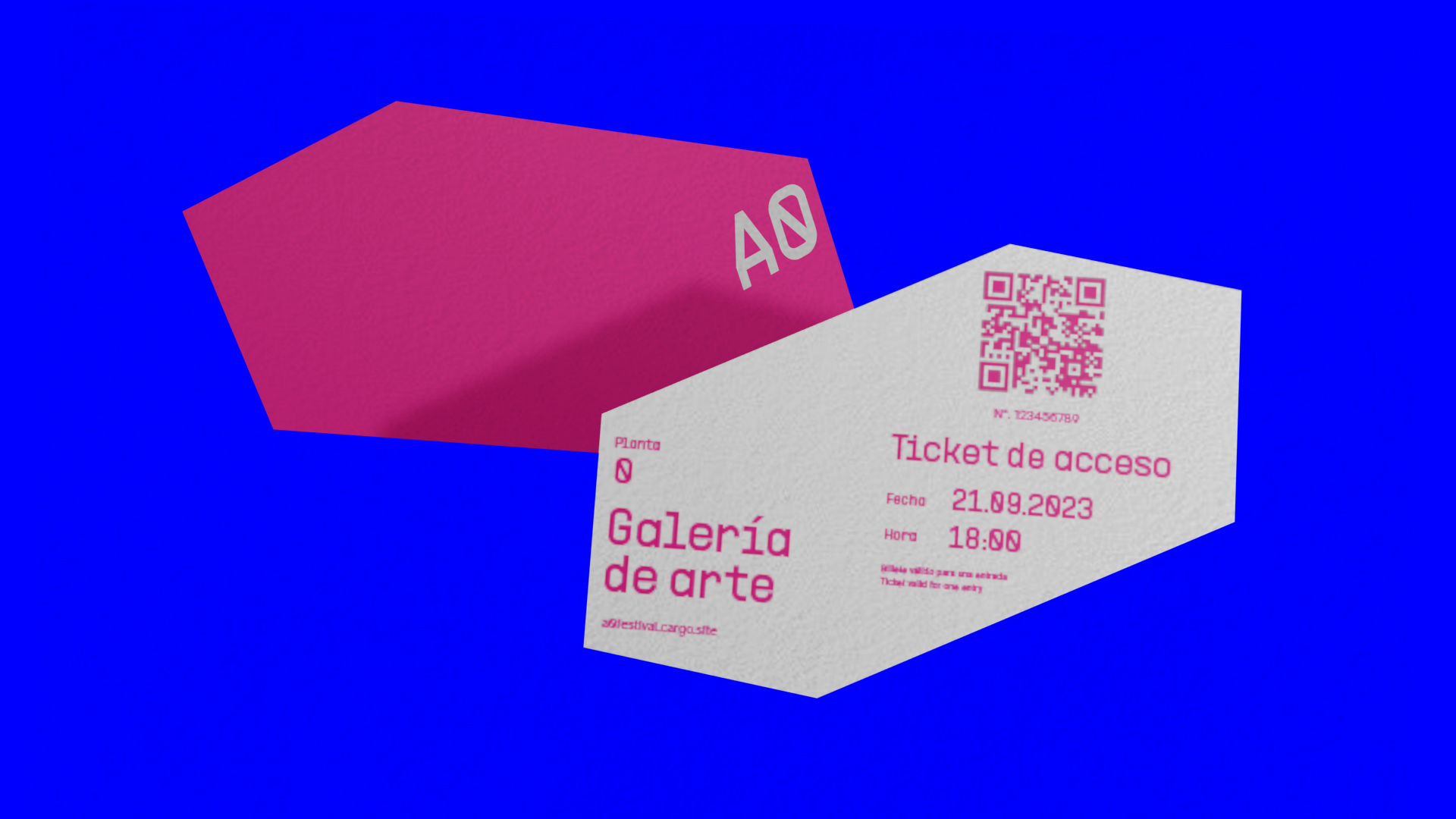
︎︎︎Ticket for the art gallery
An access ticket for the art gallery was designed to ensure a good experience for visitors. It can be purchased through A0´s website or at the gallery counter.
︎︎︎Brochure for the art gallery
An A4 size brochure printed with risograph in a vibrant pink was designed. It is a righteous way to guide and help identify the paintings on display in the “Entre acero y salitre” exhibition inside the art gallery. The brochure folds conveniently to carry in pockets or even bags for easy handling.

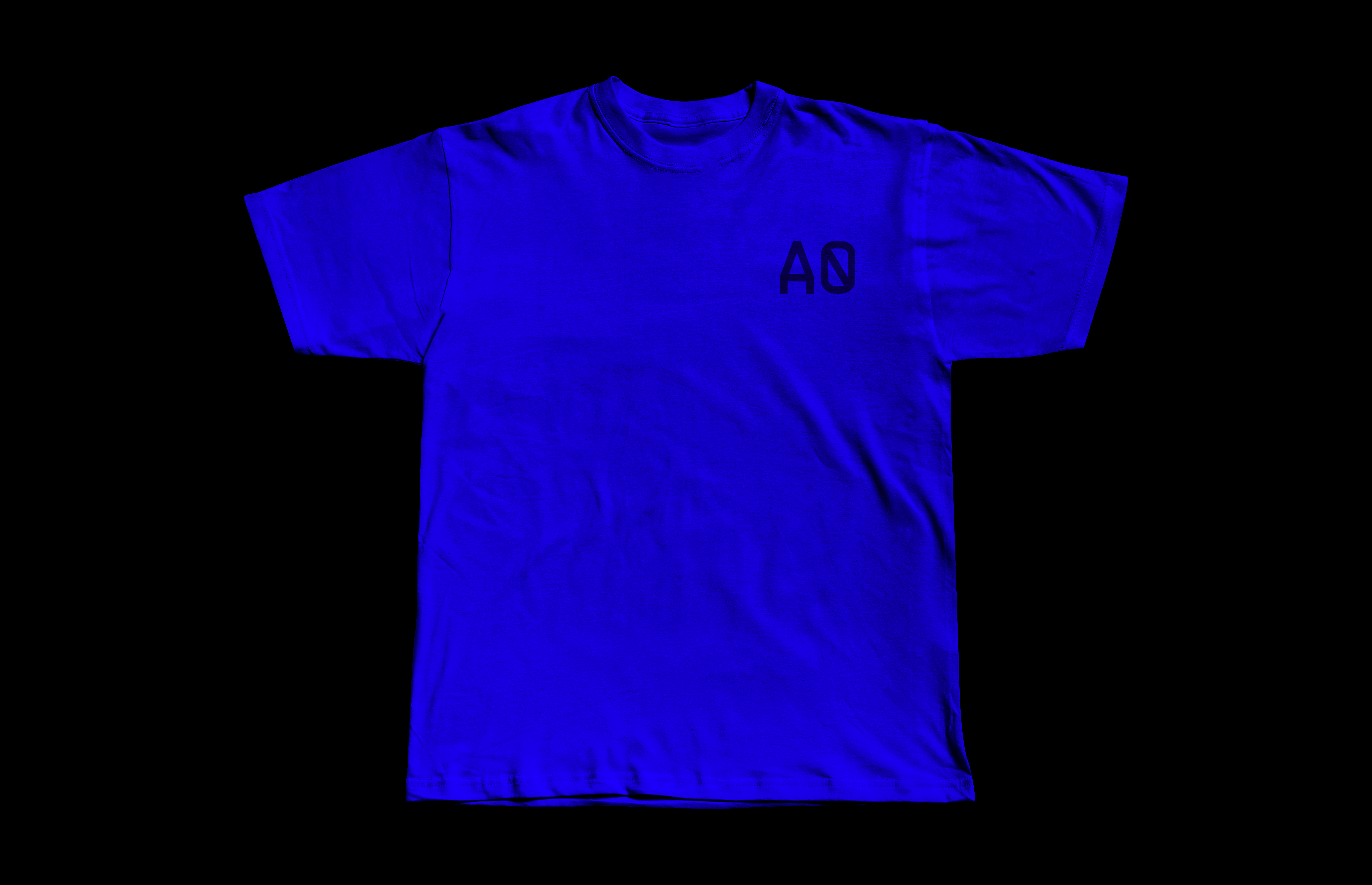
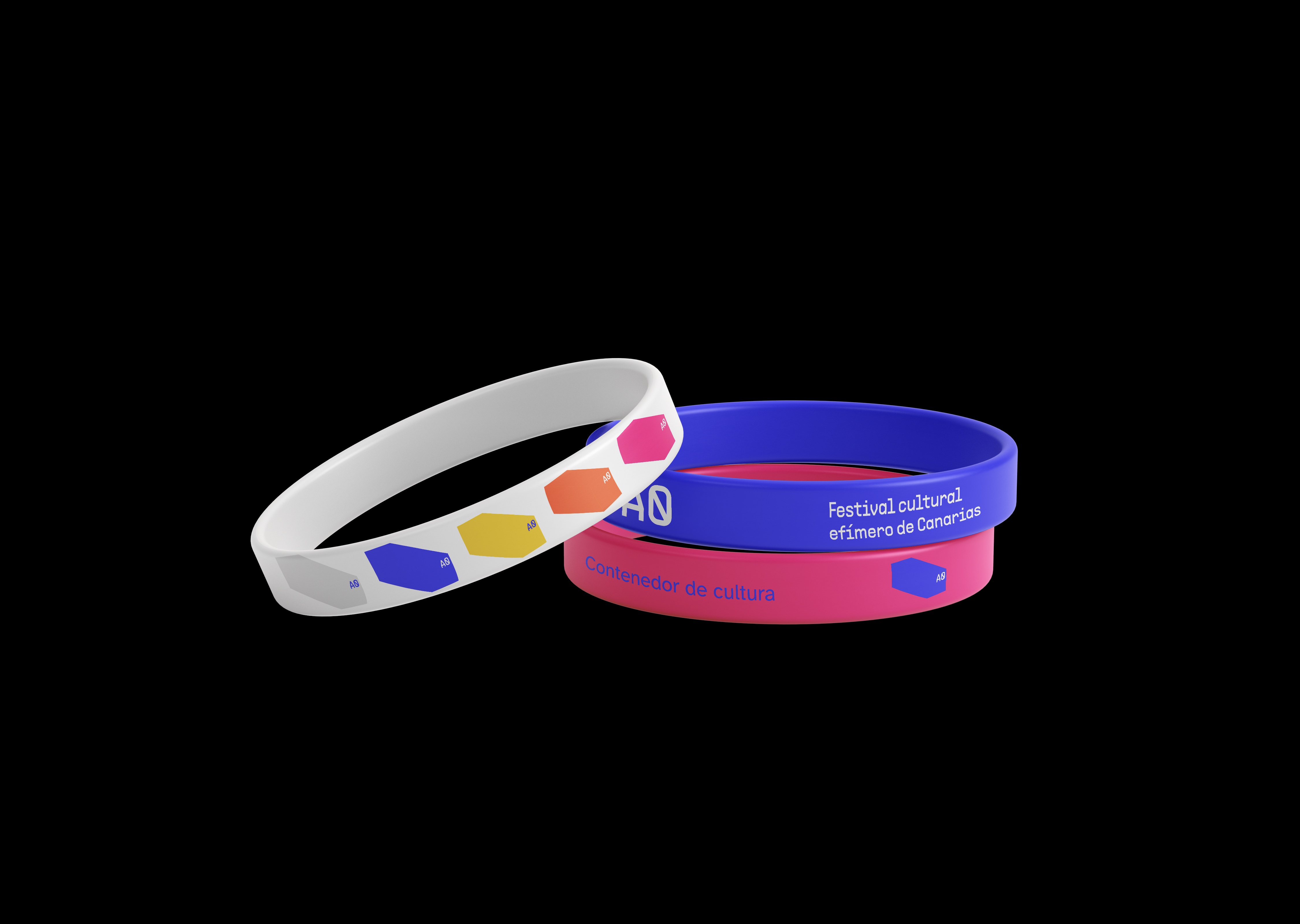
︎︎︎Brand applications
Some brand applications as a way of promoting A0 festival.